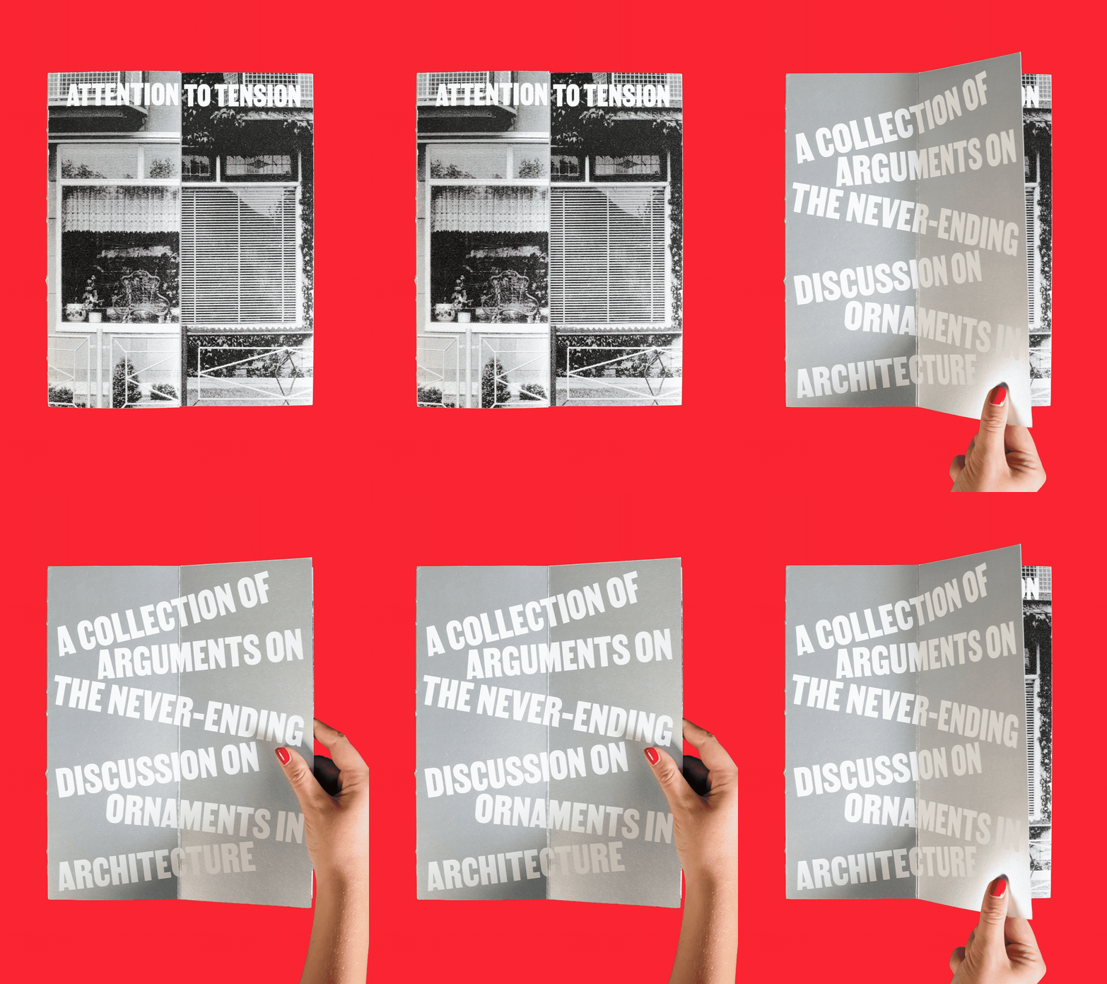
A collection of arguments on the never-ending discussion on ornaments in architecture. Since architecture surrounds us every day, we all carry conscious or unconscious opinions about it. The book starts with the question: ‘Are ornaments a disguise for the essence of a building?’ Rather than focusing solely on architecture, it brings two opposing human perspectives into conversation, allowing their ideas to collide, connect, and contrast visually. In collaboration with Madalena Mello e Faro.
2According to the mathematical Graph Theory, an object is made up of a set of connection points and lines which can be used to make multiple interpretations of itself. A Network of Dots and Lines uses this theory to reconstruct letters from their original shape into an alternative form. By identifying their common traits they can be traced back to their original letterform. This work shows five possible typefaces generated from this system.
3These animated typographical experiments that are built from small, interconnected systems. By moving certain shapes and elements within these systems, new and unique letterforms are generated. The impact of repetition and variation leads to the transformation of familiar characters into dynamic, evolving structures.
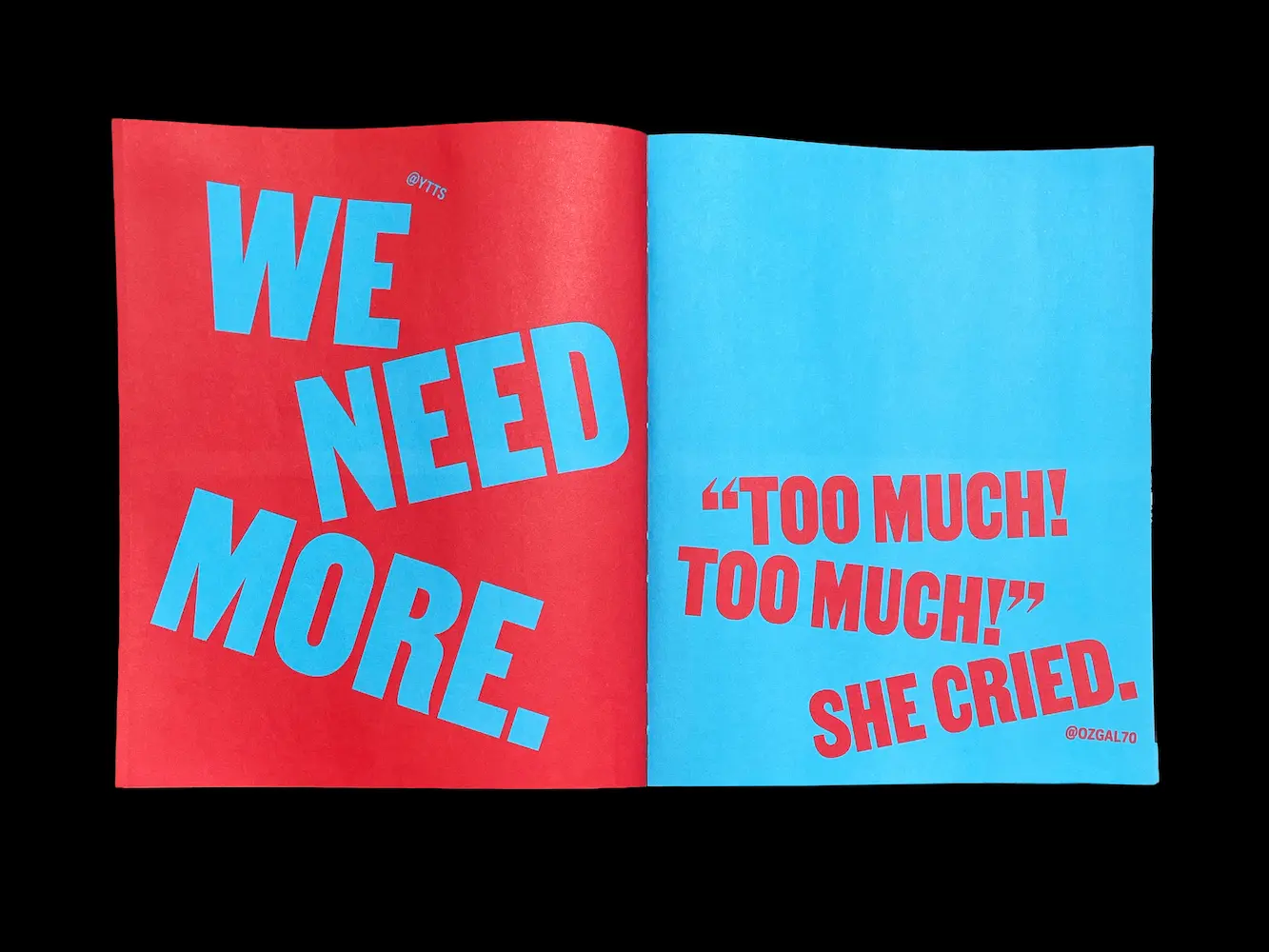
4A magazine about objects encountered outside their expected roles, exploring what they reveal about the ways people act, care, discard, and consume. The diverse found content is brought into the magazine through an experimental visual approach, incorporating plenty of manual touches, such as handwriting and scanned materials. Each issue has its own key color. In collaboration with Polina Ostapkevich & João Fischer.
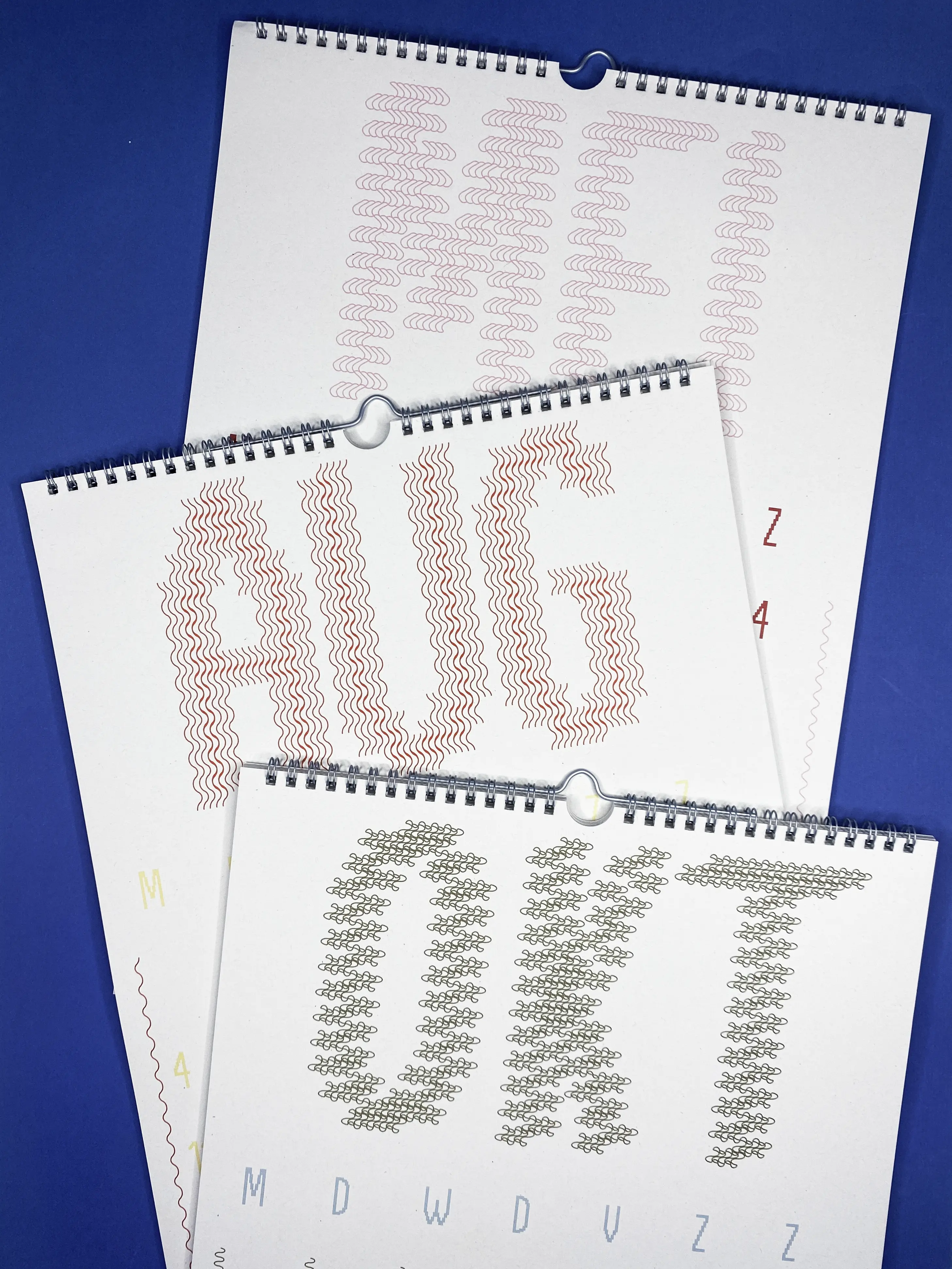
5A calendar designed with a pixel-based typeface, which is used for both the dates and as the foundation for the month names. Typographical experiments are incorporated to give each month its own unique character and visual identity. These adjustments ensure that every month stands out with a distinct appearance.
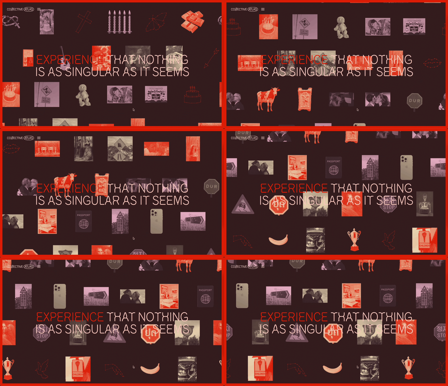
6The online magazine explores cultural similarities by talking about simple objects, common rituals and social expressions that exist almost everywhere and are familiar for most of us. Forming unexpected connections between people in a divided world by using a parallel narrative with user input. Experience the prototype link here. In collaboration with Elena Bobina.
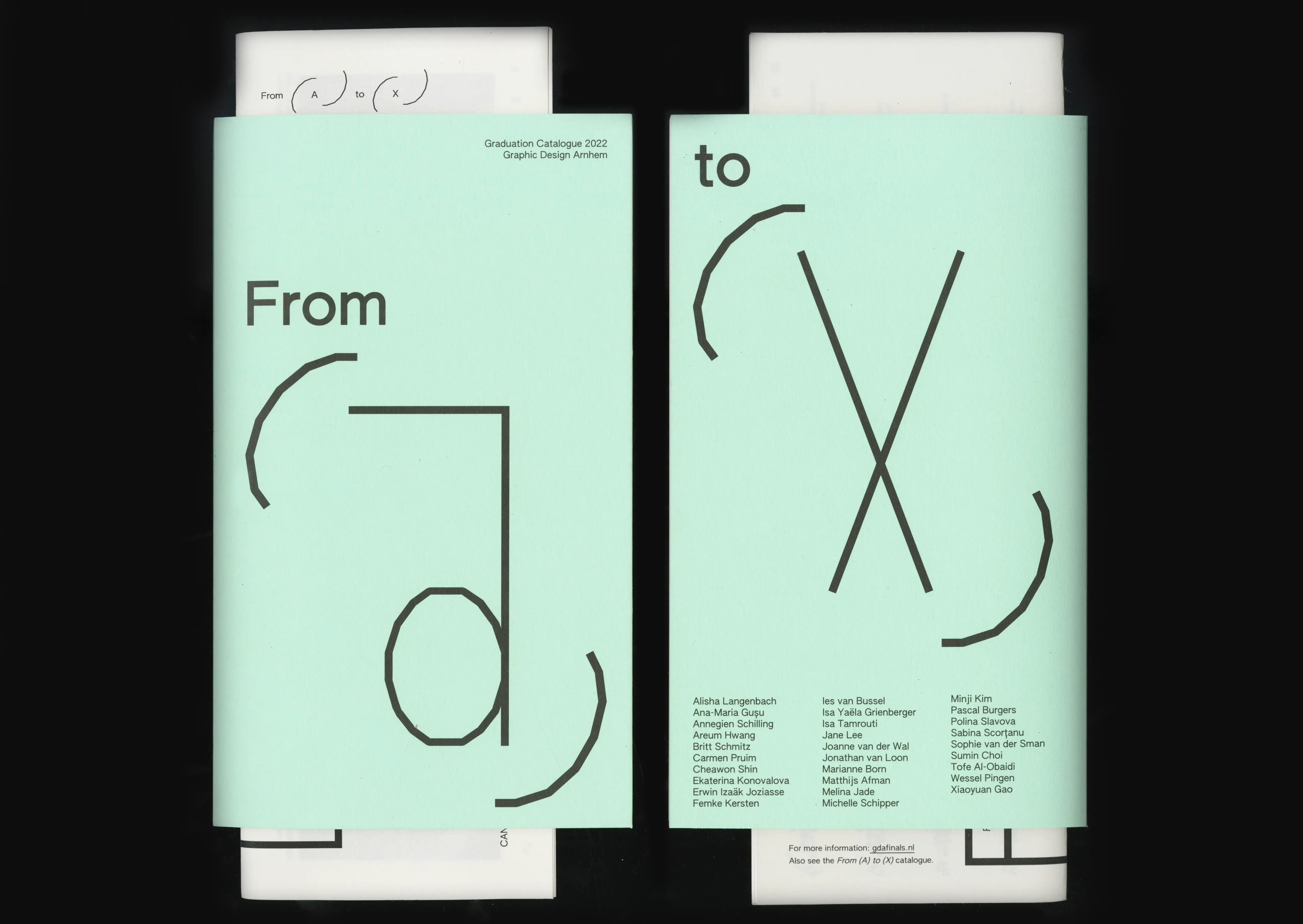
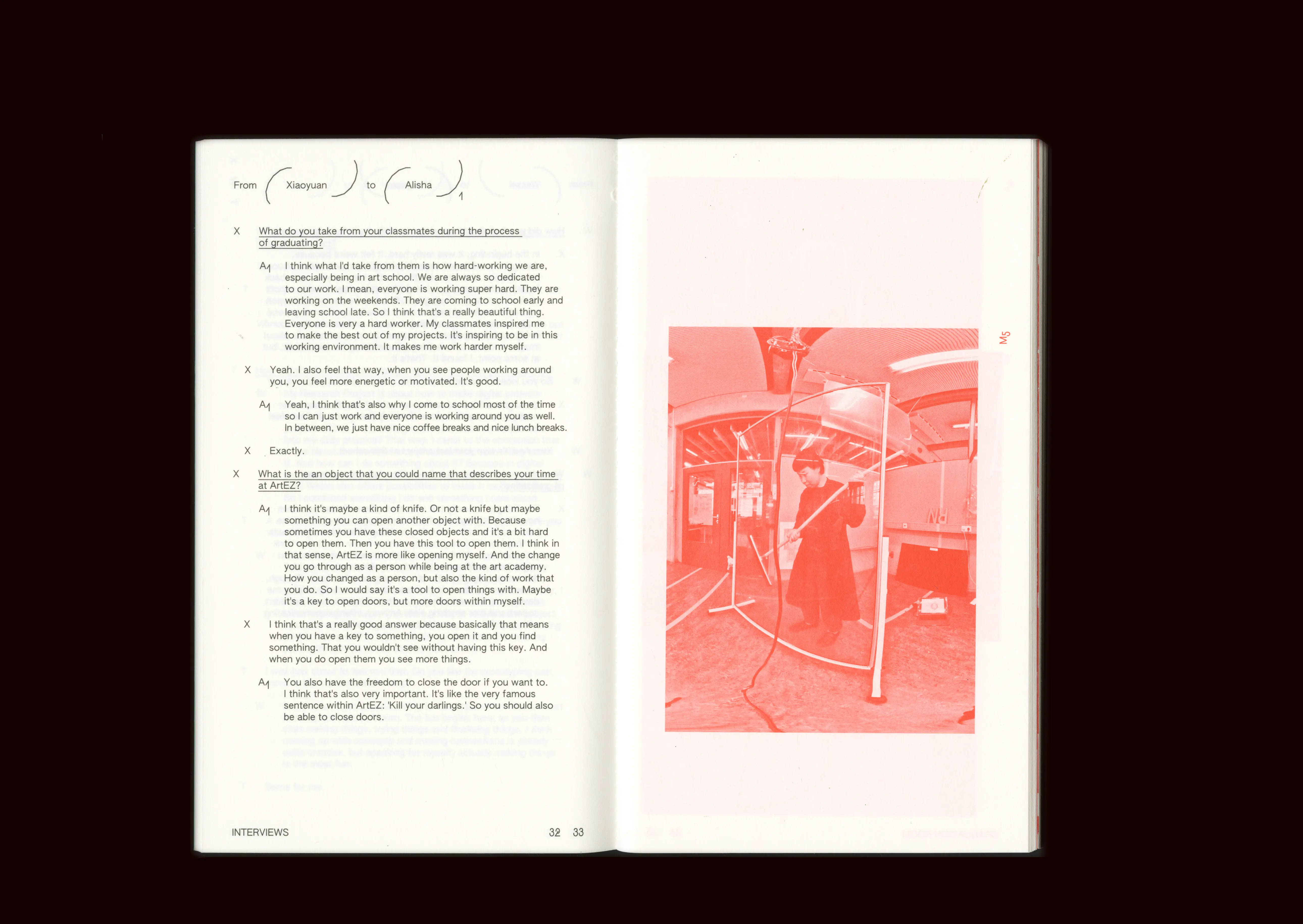
7Identity for the Graphic Design Graduation show 2022. The identity is resembling the proces of moving from point A to B, just like in a learning proces, where point A & B can be variables. This project contained a graduation catalogue showing the process of the student projects, exhibition design, website and merchandise. In collaboration with Joanne van der Wal, Xiaoyuan Gao, Britt Schmitz, Tofe Al-Obaidi.
8This publication shows the projects of several artists working in ARTIS Amsterdam Royal Zoo in the summer of 2022 within an artistic field programme, Machine Wilderness, initiated by Theun Karelse. The book is divided into two types of content. The first part are essays, which are kept simple in their layout. The second part exists out of text and imagery about the residents and their work. This is visualised in a more playful/experimental and colourful manner to show their projects in process.
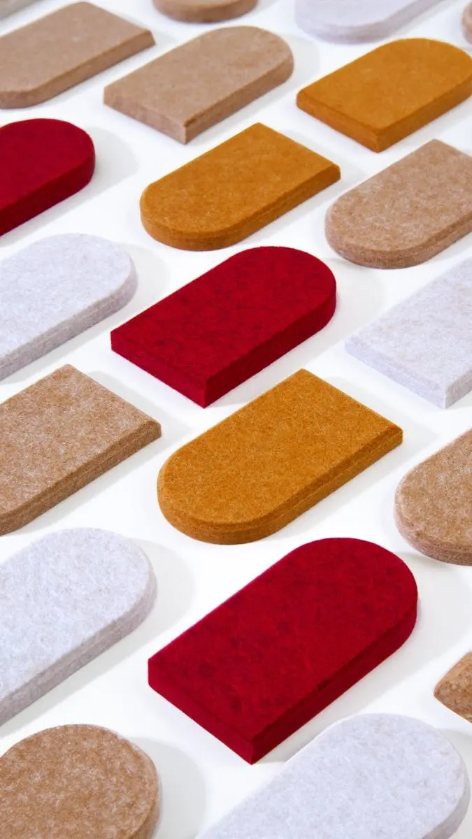
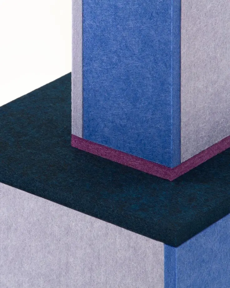
9Developing an image plan and photographing material scenery of the PET Felt panels sold by ReFelt, focusing on accurately capturing their colour range and texture. Created various concepts to make the panels appear more spacious, even at a small scale, while presenting the product in a visually engaging and playful way.
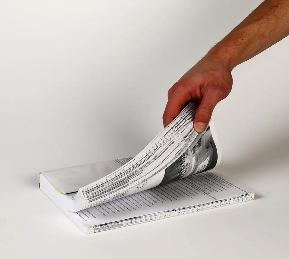
10A bilingual book about Generic Cities. Its design is based on the annoyance of footnotes and the change and speed of cities. The footnotes move through the book and crossover languages. Therefore the footnotes and images both make both languages still interact with each other. The book has two front covers, on one side you find the Dutch version and when you flip the book you find the English version.